When working with Tabular Grids, you can edit the overall design of the grid by selecting Tabular Grid from the dropdown list in the Formatting Panel and editing some details in there.
Tabular Grid Settings
This page describes the formatting options where Raw Results is selected from the dropdown list. Other formatting options that can be selected include Report Title, Data, Columns, and Color.
Labels
From the Labels tab (purple arrow below), set the formatting for the cell contents for the entire grid:
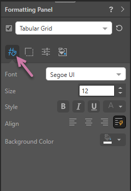
- Font: To use a different font style, click the arrow next to the default font and choose your desired font.
- Size: To incrementally increase or decrease the font size, click the Increase or Decrease arrows. Otherwise, type the font size you want into the text box.
- Style: Use the Style options to make the text or numbers Bold, Italic, or to add an Underline. To change the font color, click Font Color (letter 'A' with a colored underscore) and select your required color.
- Align: To position the text horizontally, click the left, center, or right button. The text is aligned according to your selection. Alternatively, use auto align (lightning) to let Pyramid set the alignment.
- Background Color: To change the grid's background color, click Background Color and select your color using the Color Picker.
Border
Set the formatting for grid borders formatting from the Border tab:
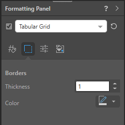
- Thickness: To incrementally increase or decrease the border width, click the increase or decrease arrows.
- Color: To change the color of the grid's borders, click the Border Color button to open the Color Picker.
- For more information, see Grid Borders.
Settings
From the Settings tab, determine the settings for column and row size, padding, and more:
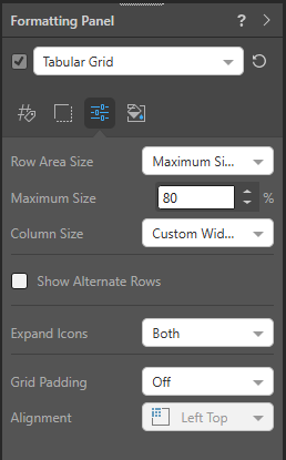
- Row Area Size: Customize the size of the total combined width of the row header columns for grids.
- Column Size: Customize the size of the grid's columns.
- Show Alternate Rows: Use the alternate rows function to display every other row in the grid in a different shade.
- Expand Icons: Turn on "expand icons" for rows and columns.
- Grid Padding: Use grid padding to increase the size of the space of gap between each column and row.
- Alignment: Alignment is disabled for Tabular and Raw Grids.
Miniature
 Miniature Color 1, 2, and 3 set the text colors for miniature visuals, which appear automatically when a visual is scaled down due to legibility limits. These miniatures show measure values and labels for quick reading in limited space. Use the Color Picker to set the color for each miniature tile.
 Example: Miniature Colors
Miniature visuals are created automatically when you scale a visual down to a size that makes its content illegible. These tiles typically display the measure as a number with its name underneath:
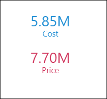
Note: The purpose of a miniature visual is to provide a way to easily view and interpret important data at a glance, even where there is a lot of information and limited space.